Understanding Title 24’s Life Cycle Energy Metric, Time Dependent Value (TDV)
Years ago, I spent many nights wishing I could discover a better way to evaluate some of the most obscure metrics in circulation in the California building energy industry. In particular, the long-term cost metrics California uses to estimate the cost of electricity and gas for buildings, also known as Time Dependent Values or TDV. These are essentially life cycle cost metrics, developed for each hour of the year; in effect, they are cost values dependent on the time of day.
If anyone has had the pleasure of reading any of the reports documenting how these metrics are created every 3 years, please email me; we should have a drink together. These are hard to fully wrap your arms around. Now I don’t want to create any misunderstandings. I greatly respect the consultants who work on these types of endeavors. At the same time, I would wager a bet that 90% of the people aware of TDV metrics do not honestly know what they are or all they entail, only that they are tough to explain and cause a lot of headaches. For those new to TDV or seeking a simple definition, here is my basic definition:

Time Dependent Values are the forecasted hourly energy costs that buildings will incur over the next 15 years (or 30 years, depending on the metric) due to forecast changes in the energy grid in relation to how power is made and distributed. These metrics allow the energy code to weigh potential efficiency enhancements to understand if, over the life of a measure, the first costs will result in a return on investment.
Perhaps you have read some of the papers on TDV and used the metric for compliance yet, today, have several unanswered questions; ok then, I am primarily talking to you. If you are like me, I generally knew what TDV was, though rarely actually looked at the data. I would see presentations by others, still the metric was just this set of numbers, buried in obscure locations on my computer.
For this blog, I am most interested in sharing a resource I made to help myself understand, see and play with these metrics. While I am generally aware that the cost metrics have improved over the years (2016, 2019, and 2022), as an energy consultant, I didn’t honestly know how they changed and rarely actually looked at them. I know there are spikes in the cost rates in summer afternoons, but what exactly is a ‘spike’? 10x? It’s hard to say unless you have time to dig through a bunch of data files and try and figure it out. So, I decided to organize the data into pretty charts and interactive tools now online in Tableau Public. The key questions I wanted to answer as I built these tools were:
- How do electric TDV costs look?
- What are the extremes and average electric cost shapes?
- How do the costs of gas compare to electric and where do heat pumps break even?
Click here to see the data on Tableau Public.
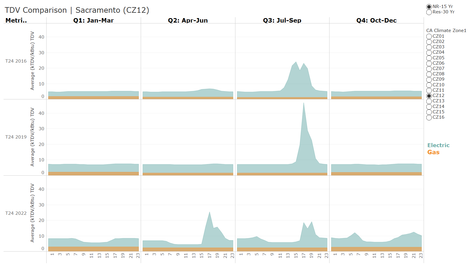
In the chart, teal is electricity; orange is gas. Metrics are overlayed, so the magnitude of electric TDV is effectively behind the gas TDV metric. While the evenings in 2022 from July to September still have a spike in electric costs, the magnitude of this change compared to the rest of the hours in the 2022 metric has been dramatically reduced compared with 2016 and 2019. Daytime costs for 2022 will show a slight reduction each afternoon now as well, which previously was not apparent in 2016 or 2019.
Beyond the long-term cost metric TDV, the California Energy Commission (CEC) also produces several other metrics useful in evaluating building energy, some of which are now used in energy compliance, including an hourly source energy metric and hourly carbon metric.
Worth nothing on the two new metrics, Time Dependent Source (TDS) and Time Dependent Carbon (TDC), the shape of the data look nearly identical, which was the rational for regulating TDS.

What are the costs of electric vs. gas, and can we electrify everything with heat pumps?
These metrics can help quickly answer one immediate question: “Can we electrify everything cost- effectively?” In policy land, this is a very common question. Technically, the challenge of energy costs is a two-step question:
- Can the cost of energy and the electricity efficiency of a system be the same or less than gas?
- Are those systems cost-effective, and will they pay back over their life?
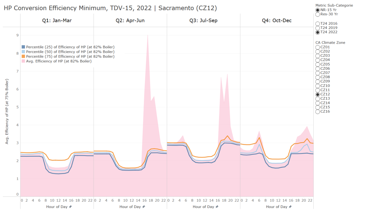
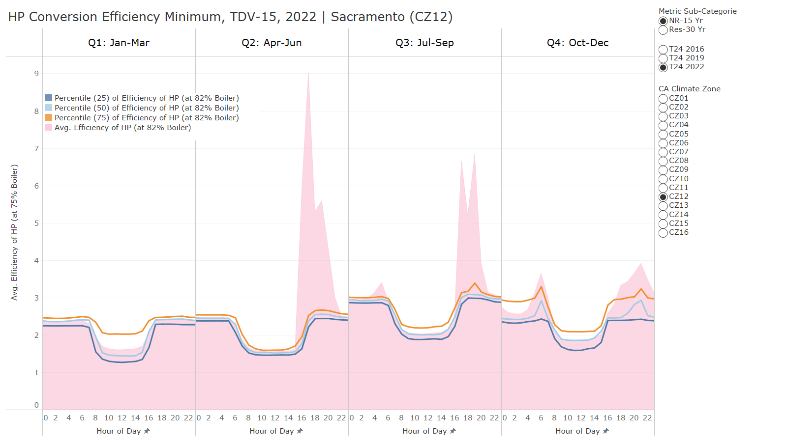
While the TDV metrics cannot answer the second question, TDV can be very informative on the first. To do so, we assume how efficient gas equipment can be for producing heat and take the average efficiency of an electric heat pump. Then, we would evaluate if energy costs can break even by comparing the two long term TDV metrics for gas and electricity. The chart below shows how using these metrics and a basic assumption about gas efficiency can be used to solve for the necessary heat pump efficiency to break even. The metric changes each hour, and three percentiles are included along with the average to demonstrate how most of the time (less than 75% percentile), the efficiency is less than 2.8 COP, which is very achievable.
Click here to see the data on Tableau Public.
California Climate and Time of Day
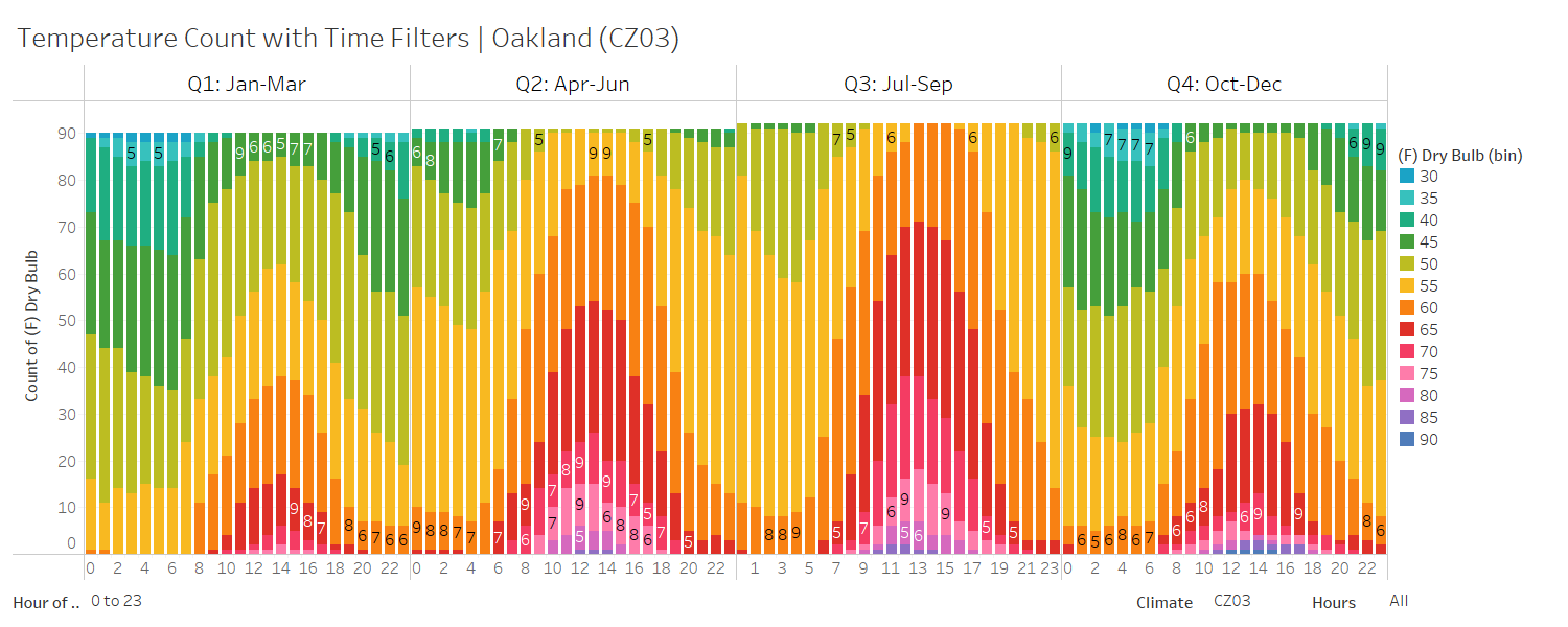
We also took the opportunity to pull in the climate temperatures for each city where TDV metrics were developed. There are a few charts where you can evaluate the outdoor dry bulb for each climate zone and see the frequency of temperature at each hour of the year. While the California climate can be temperate and include many hours of airside economizing, many of those hours are at night or early in the morning, for instance, as shown below for CZ3.
Click here to see the data on Tableau Public.
We then combined this outdoor temperature condition with the hourly cost of energy metric, TDV, to understand the cost of an hour at each outdoor temperature range.
An example of evaluating 8am to 6pm is shown below for CZ3 with the color indicating the outdoor air dry bulb and the magnitude indicating the total energy costs for that hour in that quarter.
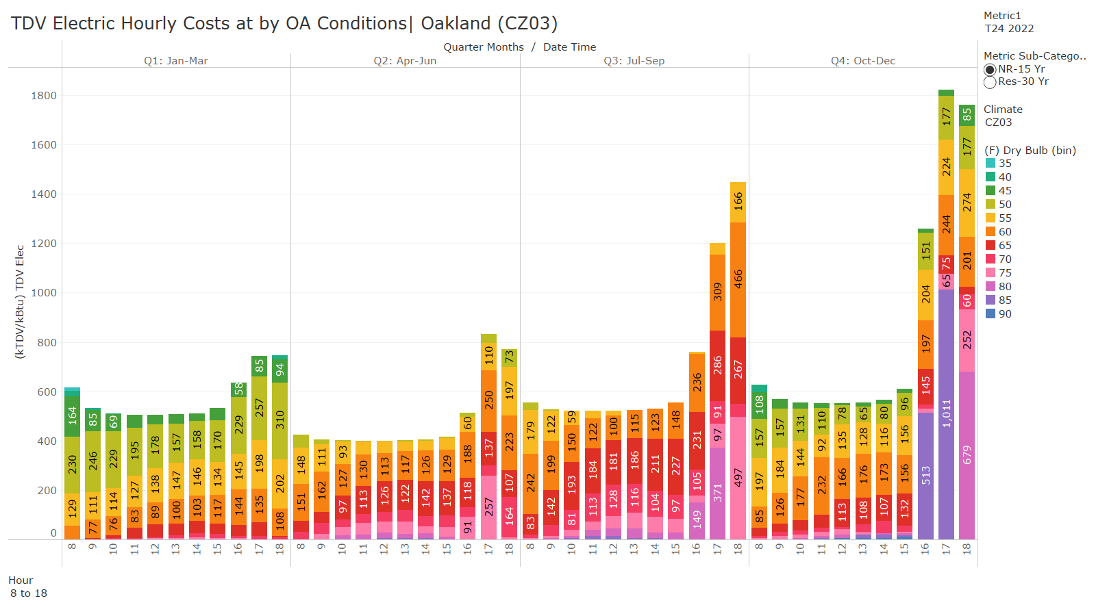 From the chart, the predominant electrical costs occur in the few hours in Q3 and Q4 during the evening when temperatures are 75F or above. Jumping down to the chart with only the temperature shown highlights the frequency of each temperature at each time of day.
 Even with very few hours above 75F in the fourth quarter, those hours can account for substantial energy costs.
We hope you all enjoy the tool; we most certainly do. We use it almost weekly to answer questions and further understand how California code compliance is evolving.


